Diagram of Gene Expression: A Step-by-Step Visual Guide
Explore a clear diagram of gene expression with step-by-step explanations of transcription, RNA processing, translation, and key regulatory checkpoints
A robust gene expression diagram visually explains the DNA-to-RNA-to-protein pathway by explicitly showing biological events, their locations, regulation, and experimental readouts. This visual discipline ensures the figure serves as a decision tool, accurately communicating complex mechanisms to non-specialists and scientific reviewers alike.
Why is a Gene Expression Diagram Still Important in 2026?
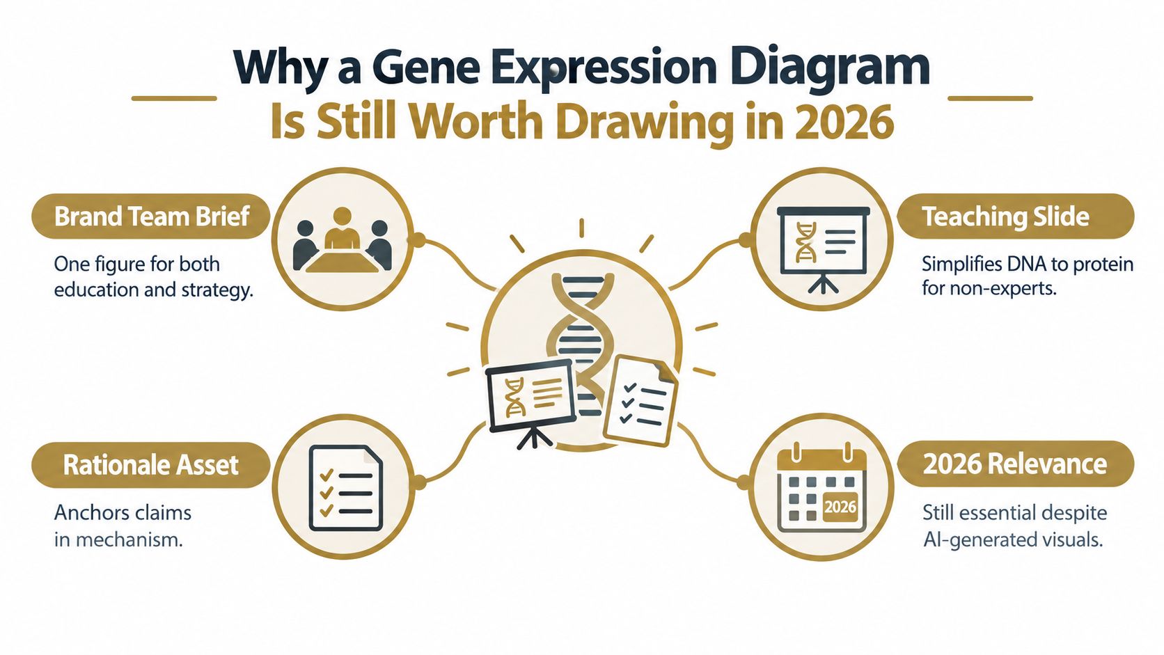
A medical writer can summarize a pathway in prose, but readers usually understand the mechanism faster when the figure gives them a stable visual route through it. A well-built diagram lets a scientific communications team place transcription, RNA processing, translation, and regulation in one view without asking the audience to reconstruct the biology from separate paragraphs.
The historical foundation is the central dogma diagram proposed by Francis Crick in 1970, which represented the directional flow of sequence information from DNA to RNA to protein. The arrows encode information transfer, not necessarily physical movement, and that distinction still matters when a designer turns a biological concept into a visual asset. The framework became a conceptual scaffold for later gene-expression technologies and remains useful for explaining gene regulation and gene networks. The historical discussion of Crick's central dogma diagram provides the relevant context.
What a reviewable figure must make visible
A credible figure has accurate compartment boundaries, named molecular machinery, directional arrows, and explicit regulatory checkpoints. It should show the nucleus and cytoplasm separately when the biology requires that distinction. It should identify the promoter, RNA polymerase, primary transcript, mature mRNA, and ribosome rather than compressing every event into a single unlabeled arrow.
A strong visual also distinguishes what's known from what's inferred. A solid arrow can represent a direct molecular step, while a dashed line can indicate an indirect relationship or a proposed connection. Every arrow should have a source in the underlying evidence package, whether that source is a publication, dataset, or approved internal study.
Practical rule: If a viewer can't tell what happens, where it happens, and how the proposed intervention changes it, the figure is decorative rather than decision-ready.
This discipline matters even more when teams use automated content workflows. A review process such as VarsaAI's AI trust layer can help organize evidence and traceability, but no platform can rescue a diagram whose biological logic was never specified. The writer still needs to define the pathway before the designer or production system renders it.
What are the Core Steps in a Gene Expression Diagram?
Read the canonical diagram from left to right, but treat every arrow as a distinct biological event. The basic model is DNA to RNA to protein, and its value comes from separating the stages rather than treating gene expression as one uninterrupted process.
Start at the gene locus
Begin with the gene's location on a chromosome. Zooming into the locus should reveal the promoter and the transcription start site. The promoter provides a regulatory region where transcription machinery assembles, while the start site marks where the RNA transcript begins.
For a eukaryotic gene, label RNA polymerase II at the transcription complex. The enzyme uses one DNA strand as a template and synthesizes the RNA in the 5′ to 3′ direction. The first product is the primary transcript, often called pre-mRNA, which contains sequence that won't remain in the final messenger RNA.
The arrow from DNA to pre-mRNA means transcription has occurred. It doesn't mean DNA has moved into the nucleus or that the RNA is already ready for translation.
Show processing as a real stage
RNA processing belongs between transcription and translation. The initial transcript receives a 5′ cap, introns are removed through splicing, and a 3′ poly-A tail is added. The result is mature mRNA, which can leave the nucleus through a nuclear pore. This overview of gene expression and RNA processing explains why the processed transcript should be distinguished from the initial RNA product.

Decode the mRNA in the cytoplasm
In the cytoplasm, show the mature mRNA entering a ribosome. Label the 5′ untranslated region, start codon, open reading frame, stop codon, and 3′ untranslated region if the figure has room. The ribosome reads mRNA codons, while charged transfer RNAs bring amino acids that are joined through peptide bond formation.
The translation arrow therefore represents decoding, not copying. The completed product is a polypeptide, which may then fold, undergo modification, or join other proteins before becoming a functional molecular output. This gene-expression primer provides the core distinction between transcription and translation.
For an MOA slide, retain only labels that support the decision the audience needs to make. If the intervention changes transcription, emphasize the promoter and polymerase. If it changes RNA maturation, give processing its own visual checkpoint. If it affects protein output, keep the ribosome and downstream protein fate visible.
How does Prokaryotic Gene Expression Differ from Eukaryotic Gene Expression?
A comparison works best when both panels use the same milestones. Put initiation, elongation, processing, translation, and termination on parallel tracks, then highlight where the tracks diverge. The difference isn't merely a matter of drawing style. Compartment boundaries and RNA architecture change the logic of the pathway.
In a prokaryotic panel, place DNA in the cytoplasm because there's no nuclear membrane separating transcription from translation. Ribosomes can begin translating an mRNA while the transcript is still being synthesized. A bacterial diagram can also show an operon, where related coding regions share regulatory control and can contribute to a polycistronic transcript.
In a eukaryotic panel, separate the nucleus from the cytoplasm. Transcription occurs in the nucleus, RNA processing produces mature mRNA, and export precedes translation. This arrangement creates additional opportunities for regulation at transcript maturation, nuclear export, mRNA stability, and translation.
| Feature | Prokaryotic | Eukaryotic |
|---|---|---|
| Cellular location | DNA, transcription, and translation occupy the cytoplasm | Transcription and processing occur in the nucleus, translation occurs in the cytoplasm |
| Transcription and translation | Can be coupled on a developing transcript | Separated by nuclear export |
| Transcript organization | Operons can produce polycistronic transcripts | A transcript is commonly presented as monocistronic in a basic diagram |
| RNA processing | Usually limited compared with the eukaryotic pathway | Includes capping, splicing, and polyadenylation |
| Introns and exons | The basic diagram generally gives them little emphasis | The figure should show intron removal and exon joining when relevant |
| Regulatory opportunities | Promoter and operon control are central visual features | Regulation can occur at transcription, processing, export, stability, translation, and protein fate |
Design the comparison around consequences
The most important callouts are no nuclear membrane, polycistronic versus monocistronic transcript organization, and the larger role of post-transcriptional control in the eukaryotic panel. Don't fill the bacterial side with eukaryotic labels to make the panels look symmetrical.
A common error is to draw the same DNA to RNA to protein pipeline twice and change only the background color. That misses the biological reason for the comparison. A useful side-by-side figure shows why transcription and translation can be coupled in one system and separated in the other, and why an eukaryotic MOA figure may need explicit processing checkpoints.
How can Regulatory Checkpoints be Added to Your Diagram?
The canonical backbone gives readers the route. Regulatory checkpoints explain the outcome. Two cells can contain the same genome yet produce different RNA and protein patterns because they differ in regulatory state, transcript processing, cellular context, or translation control. This gene-expression overview describes the pathway as a sequence of transcription, processing, export, and translation events rather than a single gene-to-protein step.
Layer regulation above the backbone
Start with transcriptional control. Place transcription factors near the promoter, and show enhancers as regulatory regions that can influence promoter activity through DNA looping. Use a pointed arrow for activation and a blunt-ended line for repression. A grouped cluster can represent combinatorial factor binding when the mechanism depends on several regulators rather than one isolated protein.
Keep the central pipeline visually dominant. If an enhancer or transcription factor occupies too much space, move the detail into a callout box and connect it with a controlled line. The main figure should still answer the practical question, which is how the intervention changes gene output.

Add RNA decisions where they change the mechanism
RNA processing deserves its own checkpoint when alternative splicing, polyadenylation, transcript export, or RNA degradation affects the proposed mechanism. Label pre-mRNA and mature mRNA separately. If the drug changes the balance of isoforms, show the branching splice decision rather than a single generic processing arrow.
A nonsense-mediated decay callout can explain why some transcripts are removed before they contribute to protein production. An mRNA stability checkpoint can show that expression depends not only on transcription rate but also on how long the transcript persists.
Finish with translation and protein fate
Translation control belongs in the diagram when the therapeutic effect changes ribosome engagement or protein output without a corresponding change in transcript abundance. Protein stability and degradation may also matter if the intervention alters how long the final product remains available.
Use dashed arrows for indirect effects, but define that convention in the legend. Identify entities consistently, using approved gene symbols, protein naming conventions, and stable identifiers such as HGNC symbols, UniProt identifiers, or ChEMBL target identifiers where appropriate. The exact identifier system should match the audience and evidence package.
Reviewer test: Remove the drug label. If the figure still shows which checkpoint changes and which readout should move, the mechanism is probably legible.
How do Textbook Schematics Relate to Real Experimental Visuals?
A pathway schematic describes the biological logic. Experimental plots show what researchers measured, across samples, cells, conditions, or locations. Medical writers need to keep those functions separate. A heatmap isn't a replacement for the pathway, and a pathway arrow isn't proof of a measured expression change.
Read the matrix before interpreting the color
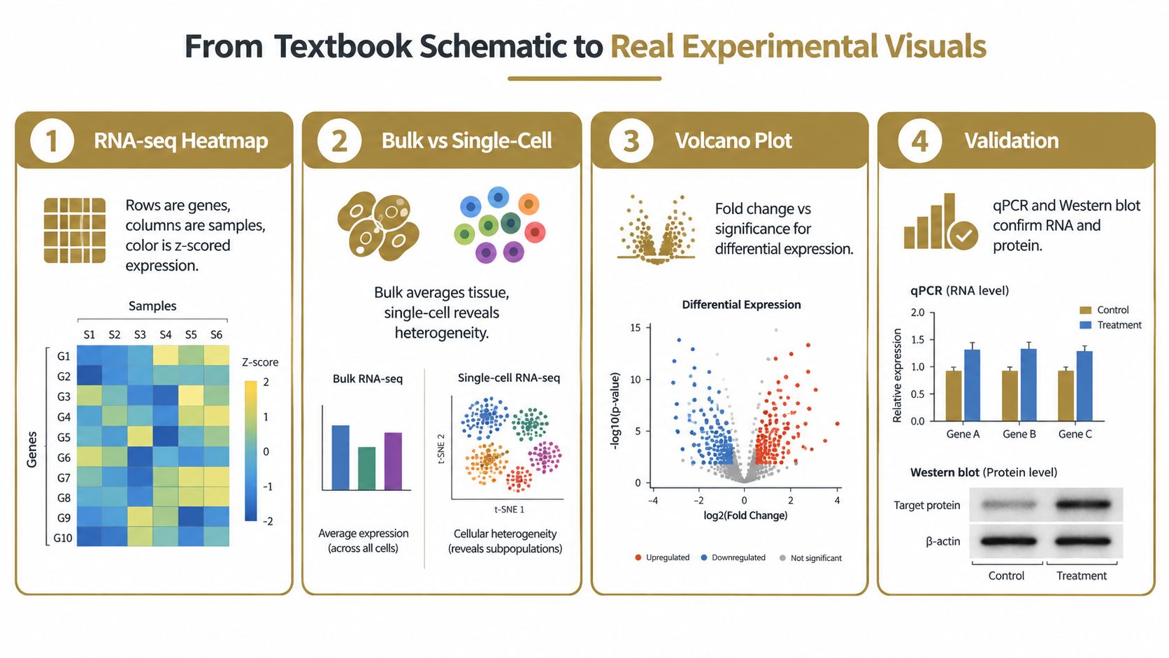
In an RNA-seq heatmap, rows usually represent genes and columns represent samples or conditions. A darker tile generally indicates higher plotted expression, but the meaning depends on the legend and normalization. If the values are z-scored, the color shows relative expression within the displayed feature, not necessarily raw abundance across genes.
Check whether rows or columns were clustered. Clustering can reveal groups with similar patterns, but it doesn't establish a regulatory relationship. A developmental expression dataset illustrates why time matters: a zebrafish study profiled 14,904 genes across 12 time points, from the unfertilized egg to 2 days post-fertilization, creating a dense temporal view rather than a one-stage schematic. The zebrafish time-course study is a useful reference for that visual transition.
Treat single-cell plots as linked views
A single-cell figure often combines a UMAP or t-SNE projection with feature plots, violin plots, or dot plots. In a UMAP, nearby points reflect similarity in the analyzed representation, not phylogenetic distance. When the plot is colored by a gene, inspect the color scale and the cell cluster annotation before describing a cell type as the source of expression.
Bulk RNA-seq summarizes expression across a population, while single-cell RNA-seq can expose heterogeneity that a pooled measurement hides. This comparison of bulk and single-cell RNA-seq explains why the choice of visual depends on whether the question concerns an average tissue signal or cell-specific states.
A violin plot shows the distribution of expression across observations. A dot plot often combines the fraction of expressing cells with average expression, so don't interpret dot size and color as the same variable. A volcano plot places effect size against a significance measure. Points near the outer regions may represent stronger changes, but threshold lines, multiple-testing methods, and labeling rules must be checked before making a claim.
Use spatial maps to restore context
Spatial transcriptomics maps expression onto tissue architecture or histology. The color scale can be nonlinear, and a bright region doesn't automatically mean that every cell in that region expresses the gene. Read the tissue image, spatial unit definition, segmentation method, and normalization together.
The field increasingly treats expression as multi-dimensional across time, space, and cell identity. That means the most useful “diagram” may be a linked set of views: a pathway backbone for mechanism, a heatmap for condition-level patterns, a single-cell plot for heterogeneity, and a spatial map for location.
For every experimental visual, apply three guardrails:
- Check normalization: Confirm whether the plot uses counts, transformed values, z-scores, or another measure.
- Separate association from causality: A correlated expression pattern doesn't by itself prove that one factor regulates another.
- Read the methods: Reusing or adapting a figure requires understanding its sample definition, analysis pipeline, and statistical thresholds. For teams converting scientific evidence into motion or presentation assets, a workflow such as scientific video production can support the format change, but the underlying interpretation still needs expert review.
How can Publication-Ready MOA Visuals be Built from a Gene Expression Diagram?
A publication-ready MOA visual starts with a biological question, not a template. Write the intended interpretation in one sentence: for example, the intervention changes a specified regulatory checkpoint, which changes transcript or protein output in a defined cell context. Then design only the pathway elements needed to support that sentence.
Apply label discipline
Use the full gene or protein name on first mention when the audience may not know the symbol. Follow the relevant convention for italicized gene symbols, protein capitalization, and species-specific nomenclature. Keep abbreviations in a legend or glossary rather than forcing readers to decode them from the artwork.
Build the figure at its final intended size. Labels must remain readable in a manuscript, slide, or PDF export. Don't rely on color alone to distinguish activation, inhibition, cell type, or experimental condition. Pair color with arrow shape, line style, labels, or patterns so the figure remains interpretable for readers with color-vision differences.
Tie every arrow to evidence
Create an evidence map before production. Each direct arrow should connect to a PMID, dataset, approved internal study, or other authorized source. A small superscript, callout, or figure legend can point to the evidence without turning the main pathway into a reference list.
The source package should also preserve the distinction between direct evidence and interpretation. A measured increase in transcript abundance supports a transcript-level claim. It doesn't automatically demonstrate increased protein abundance, pathway activation, or clinical benefit.
The source document management workflow is relevant when teams need controlled versions of publications, internal studies, legends, and approved claims. Keep the editable source file, evidence map, figure legend, and review history together rather than treating the exported image as the only record.
Preempt predictable objections
Reviewers commonly question single-pathway arrows that hide competing routes, missing negative regulators, and undefined cell context. You can address those objections without overcrowding the figure by using a main backbone plus focused callout boxes.
Use this production checklist:
- Define context: Name the cell type, tissue, disease state, or experimental condition.
- Show the intervention point: Place the drug, modality, or perturbation at the checkpoint it affects.
- Explain arrow conventions: Include activation, repression, indirect effects, and uncertainty in the legend.
- Complete the legend: Define abbreviations, colors, line styles, compartments, and adapted elements.
- Protect accessibility: Use contrast, redundant visual cues, and readable labels.
- Control versions: Store editable artwork, source evidence, and approved copy with clear version history.
- Review compliance: Route the visual through applicable scientific, medical, legal, and regulatory review.
- Make it testable: State the expected RNA, protein, localization, or functional readout implied by the diagram.
A good MOA figure lets a viewer predict the experimental readout from the visual alone. If the figure claims that a regulatory intervention changes mature mRNA, the supporting experiment should measure that layer. If it claims a protein-level consequence, the evidence should reach protein abundance or function rather than stopping at transcription.
VarsaAI can ingest scientific and internal source materials, generate MOA videos and presentations, attach sentence-level evidence references, and support scientific accuracy and compliance review through its structured workflow. Visit VarsaAI to see how the platform can help your team turn an evidence-mapped gene-expression diagram into review-ready scientific content.
Frequently asked questions
- What is the central dogma diagram?
The central dogma diagram, proposed by Francis Crick in 1970, illustrates the directional flow of genetic information. It shows information moving from DNA to RNA to protein, serving as a foundational concept for understanding gene expression and regulation in biology.
- What elements should a credible gene expression diagram include?
A credible diagram must include accurate compartment boundaries, named molecular machinery (like RNA polymerase, ribosomes), directional arrows, and explicit regulatory checkpoints. It should distinguish between known and inferred steps, with all claims supported by evidence sources.
- Why is RNA processing considered a distinct stage?
RNA processing is a crucial stage because it transforms the initial pre-mRNA transcript into mature mRNA. This involves adding a 5′ cap, removing introns through splicing, and adding a 3′ poly-A tail, which are essential for mRNA function and nuclear export.
- What are polycistronic transcripts, and where are they found?
Polycistronic transcripts are mRNA molecules that code for multiple proteins from a single transcriptional unit, common in prokaryotic gene expression. In bacteria, operons can produce these transcripts, allowing related genes to be regulated and translated together.
- How do experimental visuals like heatmaps and single-cell plots differ from pathway schematics?
Pathway schematics depict biological logic, while experimental visuals show measured data. Heatmaps summarize expression across samples, and single-cell plots reveal heterogeneity, both reflecting actual experimental results rather than conceptual flows of information.
Add the trust layer to your LLM.
Every claim verified, every citation listed — inside your existing AI workflow.
Get pricing →